Nagoya City Science Museum
TOP > Global Warming > If the growth rate of carbon dioxide remains the same,the world temperature...

If the growth rate of carbon dioxide remains the same,the world temperature...
The diagrams below display the worldwide distribution of temperature changes showing the difference in calculations of future world temperatures by computer based on the following two scenarios.
- Carbon dioxide discharge levels continue to rise every year (1% per year)
- Future carbon dioxide discharge levels remain as they are today.
With carbon dioxide discharge levels gradually creeping up as they have been,
- the more red a region is,the more warming is amplified,
- and regions coloured in blue will experience delayed warming due to the increase in carbon dioxide discharge levels.
The colours and numbers shown on the left hand side relate to temperature change.
For example, red indicates a temperature change of 5 to 6 degrees Celsius.
In 31-40years:
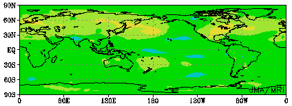
An overall rise of about one degree Celsius is observed.
In 50-60years:
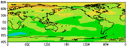
A rise of 3 degrees or more can be seen in Northern Europe and Siberia.
In 70-80years:
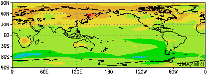
A rise of 3 degrees or more can be seen in Europe, Russia, northern China, northern Canada, and the southern part of Africa.
In 90-100years:
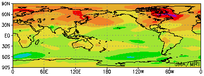
A rise of 5 degrees or more is shown in northern parts of America, from northern China to Russia, and in the north of Europe.
Thinking about the trends mentioned above in reverse,
The temperature rises shown in these diagrams can be prevented simply by stopping the current upward trend in the amount of yearly carbon dioxide emissions, and ensuring emissions don't supersede current levels.